Saturday, November 27, 2010

Thoughts for Drawing Final Project

Lately I've been thinking about music. I drove down to Maryland for Thanksgiving and I was listening to music on the drive there and back, and I just thought how much the music in my life affects my mood and who I am. I don't make music but it has always been a part of my life in someway. I love how a song evokes tears from me or laughter or hope. I think its beautiful and I'm thinking I want to do something with that. It is just a thought but maybe...
Also a while ago when I took notes for this project I thought about having two figures frame the paper and then one in the distance which would be me in the middle. It's kind of a combination of the fact that I think it would be neat compositionally and also because I think it shows a little how I am in the shadow of my two older siblings in a way because I am just starting to come into "the adult world" while they may already be in it. I'm still unsure of execution but its is a start.

Sunday, November 21, 2010

Music Video Assignment

So with the help of some paint and some playing cards my mom stuffed in my bag before I left for college, I was able to get this project done. Song is by Rusted Root called "Send Me On My Way." And I couldn't figure out how to put the actual video on here but the link will still take you to it! Enjoy

http://www.youtube.com/watch?v=QIp-gxiKLkM

Friday, November 12, 2010

Figure

Perspective


"The point is, that every piece of art changes your whole perception of the rest of the world for the rest of your life. And it's not a joke! And if it doesn't, then it's not art, it's a commodity." -Lawrence Weiner

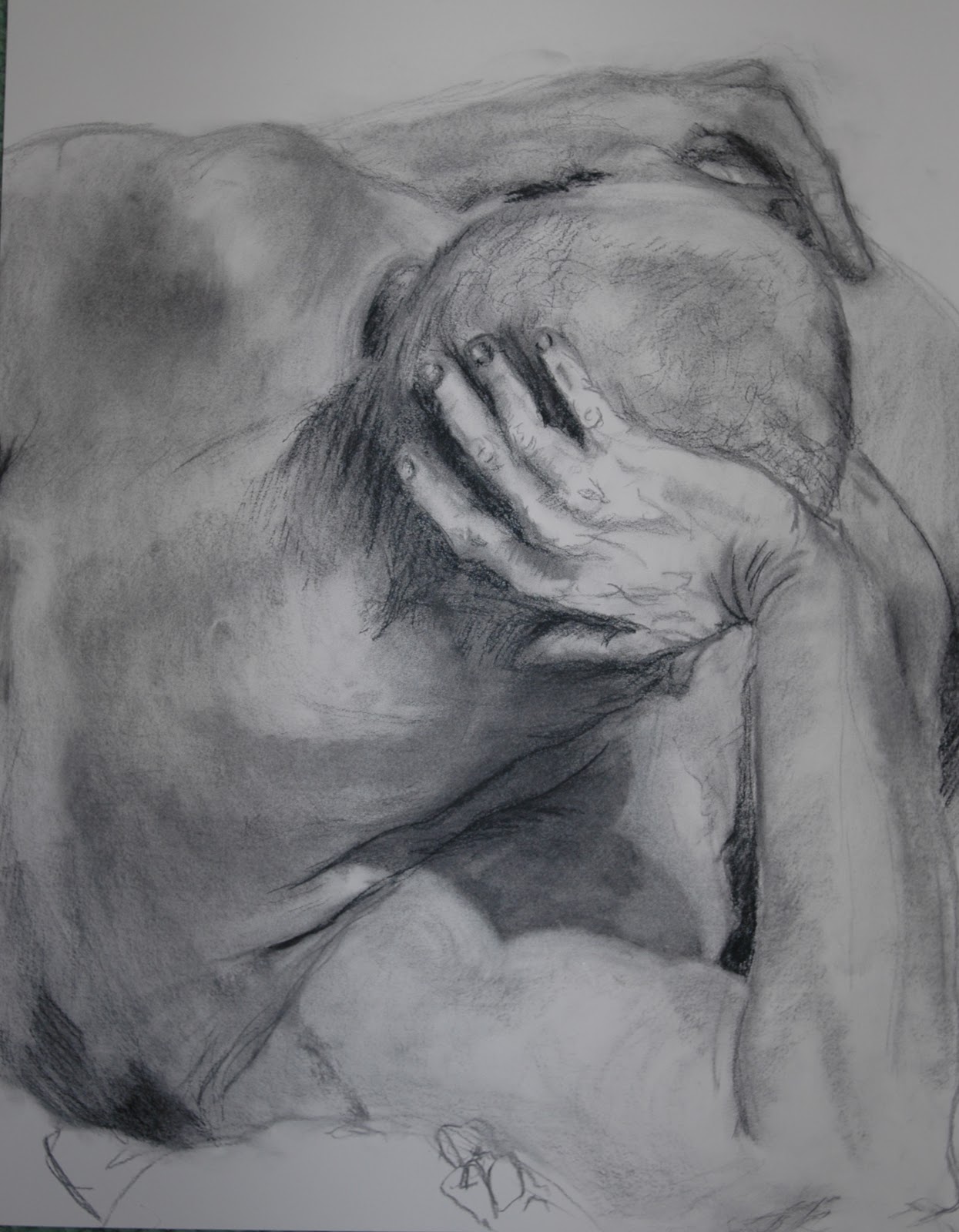
This is true. It is in some sense completely true that every piece of art can change your whole perception of the world, however one must take into account that beauty is in the eye of the beholder so therefore this statement has truth, yet not in every case. I think that as far as individuality goes, which each person has, to see a piece of art can be objectively life changing to that person. For instance, I might think that Jean-Baptiste Carpeaux’s Ugolino and Sons is one of the most beautiful pieces of sculpture in the world, however some might find it disturbing. However, now that I think about it finding the piece repulsing might still make the quote hold truth even more because it is still having an affect on a person rather than leaving nothing with them. And even with more truth in that quote if a piece of art has no affect in it than maybe it truly is just a commodity.
Boring?
It makes me think of hotel art, that just seems to hang on the wall to hang and really serves little purpose to beautify the room or to have a person stop and look at it for a while… well unless you go to a fancy hotel where they can afford art with a purpose. Purpose being, not a work of art that just covers a blank space in the wall to just be there, but rather maybe fills the room to be part of a theme or because someone appreciates its look. When someone asks me “What does boring art look like?” I always associate this boringness with hotel art. They use pastels sometimes that make up a sort of abstract weirdness that sometimes is blended into the wallpaper of the hotel because they are so similar. Or sometimes it’s an elaborate landscape of hills in Colorado; Or maybe a scene of a lake in fall. And while, maybe someone can think it looks nice, if we feel nothing from it then maybe that is what makes that type of art simply a commodity and nothing more.
            And then I have a contradiction of thought. What if the fact that I can even remember some of these hotel art “paintings,” then they did leave a sort of affect on me? And in that way maybe that really does make them pieces of art. They did in fact change my perception of art in a way. Maybe not in the sense that when you first read this quote one would think of, that art that has a positive affect on a person is life changing, but maybe in a different way. Perhaps, if a piece of artwork has a negative affect, like hotel art does for me, then perhaps that means that it is not just a commodity but is still part of the realm of inspirational and life changing art. So when I think of the affect of hotel art on me, because I completely feel nothing from it, and recognize that fact, it is steering me into the right direction of what art should be, for me. It shouldn’t mask itself with a boring composition with just some splatters of pastels. And it shouldn’t be a boring hill somewhere in the Midwest. For me, it should house some sort of feeling, rather than a blank face that would sit on the wall.
            For that reason, then even the most unmoving and non inspirational of art, for anyone, can have some sort of affect on an individual, positively or negatively alike and therefore can make this statement even more truthful. Any piece of art has some sort of influence on an individual, so possibly there is no art that is simply just a commodity. Cause even when we walk past a piece of art and do not even look at it once, then that means that it is influencing us in some way. Maybe I can stretch this idea I’m making that the fact that we didn’t acknowledge that work of art means it is influencing us, pushing us towards some piece of art that is more attractive and therefore truly life changing. 

Thursday, November 11, 2010

Lead Pencil Studio

Primarily architects, Annie Han and Dan Mihalyo, make up the collaborative to make Lead Pencil Studio. This is their sort of "artist persona" to their mathematical and very organizational tendencies of their architecture training. They have been working on architecture since the early 90s but have been doing their side projects in art since the mid 90s. They talked about their process a lot and even from that everything has a purpose and is deliberately planned, which is interesting to see. They really got into billboards and different kinds all over the country, particularly in the west. The piece to the right is one example of a sort of interpretation they had on a billboard and it is located at the border of the US and I think, Canada. They do this amazing designing that even though is so technical is so beautiful. The stainless steel wire pieces look so easily manipulated and yet when they talk of the process of how it took 8 months to build with 4 people working on it, clearly it wasn't that easy. They talked of more works to come with their scientific and mathematical approach which is awesome to see art thrown into that mix.

Saturday, October 30, 2010

Jessica Hische

To say I was amazed with Jessica Hische would be an understatement. I truly think this is a direction I could see myself in. Hische is an upcoming illustrator and typographer. She designs for big industries and small industries alike and is amazingly accomplished for only graduating from Tyler in 2006. She pretty much chronicled from her graduation to the present of what she has been doing with her life. After applying to many places she got a job in New York which truly changed her life forever. From there she blossomed and now freelances her craft. She does lettering and typography and has managed to mix the two using the internet a lot to get her stuff out there. She also kept stressing the difference between Illustration and Design. She explained in Illustration you get an assignment and due dates and the client is never totally consulted whereas with design there are more meetings and revisions. Her whole speech just enticed me to the idea of moving to New York. I had the choice to go, however I thought that at my age Philadelphia was less intimidating. I think I would be able to handle New York in time. This might be something I could do with my life. I love the commercial style that Hische has and that is something I really do want to emulate in a way and make into my own somehow. I am a little unsure if illustration is what I want or even typography but the idea is coming more and more to me so we will have to wait and see!

Friday, October 29, 2010

Ben Volta

Different from many of the speakers that have come to Tyler, Ben Volta, is more of an artist with a cause. He works mostly with students from middle school to high school developing on their creative skills through giving different assignments. He seems like a natural teacher starting out with simple ideas for his students and then building on those ideas. For instance he let a group of his pupils draw whatever they could think of that one would find in certain rooms in houses. Like in a kitchen there is a table and a sink and so on. From there through working together on computers and designing they were able to make a mural that would be like wall paper on the side of a building using all those little images that they had drawn in the first place. He just seems like he has such a direction and vision for how he wants kids to progress creatively. And somehow he is able to get out of these students a sense of a collaborative style that who can say his Volta's or theirs because he is more of a creative director and they are more of the artists. It is interesting to see the different kind of work one can do with an art degree and passion.

Wednesday, October 20, 2010

Change the Meaning


H. John Thompson

An artist who graduated from UArts, John Thompson, went on a journey talking about his work. He detailed how his studio is set up in the basement of his grandfather's bakery and how it is unintentionally set up in the same way that the back of the bakery is set up. Thompson just feels like such a handyman when he talks about what he did to achieve what he did, however when he talks about his work its is just an artists mind. He builds most of his "paintings", as he calls them, out of wood and gives everything a homey, old lake house feel. It probably helps, the fact that he was a carpenter before he went to graduate school. It just seems kind of mathematical all the things that he does, because even when he is making "drawings"or "sketches" as he calls his little miniature models and/or sculptures that are intended to be a window to what will be a larger project, everything is so planned out meticulously. He was pretty fascinating with what he was able to accomplish, like building a shed to house an old truck and then it became art and he set it up in the UArts gallery. Everything he was explaining was done so nonchalant, as if his feats were just something that happen to him and not something that really is hard to do and amazing. For that he was really interesting to watch talk about his experiences.

Tuesday, October 5, 2010

Doug Bucci


Today the artist, jewelry maker, designer, and there is definitely more you could call him because it seemed like this guy does it all! He incorporates science and his condition of diabetes into so much of his work and the products look awesome. For instance in this piece it looks like blood cells made into a necklace. I was amused by this speaker's enthusiasm throughout his speech talking about his process, his life, and his work because most of the people who have come to talk really haven't been this engaging or kept me listening the whole time. He gave helpful hints to making it as an artist and my number one favorite and I think that something that I am really going to use as  motto in my life, is to be uncomfortable. He explained that you should always put yourself in something that you are not comfortable doing and therefore you will produce some of your best work, push yourself, and in the end learn, which is ultimately, in my belief, what life is about. I know a lot of Bucci's work is commercial but I really liked that aspect of him and it makes me think about going into industrial design or using CAD or something. That's actually what my parent's degrees are in, but up until now I never gave it that much attention. I don't think I would totally be comfortable doing that and I think that may be a good thing.  

Monday, October 4, 2010

TED.com speech: Rives on 4 a.m.

The poet, John G. Rives, gives a fascinating and hilarious speech, filled with irony. I had to watch it a few times because of the pure coincidental connections that so many things in this world have tied to the time of 4 o'clock in the morning. Rives talks about how its the worst possible time to be awake in the morning and yet people seem to always be doing things at the time. For instance he says plotting someones killing in the movie "The Godfather." He goes on this whole web of connections to what people are doing at 4 in the morning. In his whole schpiel he gives it the name of the "Giacometti Code." It is here, in the picture above where Giacometti, an sculpture and artist, has a piece called The Palace at 4 in the Morning. This was made in 1932. Rives then goes on a rampage of hilarity, linking actors and writers to Giacometti and his life. I cannot do it as brilliantly as he does but just typing into google "4 a.m.", brings up a lot of connections to the actress Judy Dench, another famous actor who killed himself the same day that a writer was receiving the Nobel Prize. And coincidentally enough she was born in 1932 when the sculpture above was produced! The connections keep going and I found that to be so incredibly interesting and fascinatingly funny. Rives delivers this speech so well that had anyone else done it, it probably would have been interesting but not as much so and not as humorous as Rives made it. I totally recommend watching, if not once, more.


Friday, October 1, 2010

"Persona"

In actuality I find myself struggle a little at what I thought of “Persona.” I liked it, but I didn’t at the same time. I think while I was watching it I was annoyed with the flashing of random images and sometimes many clips were in there that did not actually add or take away from the story – they were just there and I found that to be very odd. But then I think back to specific scenes, particularly ones that involved Sister Alma spilling her guts to Elisabeth, or them at the sea and I am intrigued. I liked how you definitely know from the start that you are going to have to watch this movie a few times to really grasp what’s going on and what all the symbolism is about. That is one thing I really did enjoy about the film, the constant symbolism and metaphors. I didn’t get all of them, I do admit and some may get bothered by that but I liked how things had a hidden meaning and even now I am trying to think back to what this meant and that meant. Like with the glass that Sister Alma deliberately leaves on the ground for Elisabeth to step on. Or when Ingmar Bergman put in Sister Alma’s monologue in twice. One with the focus on Elisabeth and the other with the focus on Sister Alma. I wonder the symbolism behind all of that and what the purpose was. I can guess that it was to make the viewer really focus upon “the artist”, Elisabeth, and her reaction to what had happened to her and then to see “the subject”, Sister Alma, and how her resentment for being the subject of Elisabeth’s skill and how this story makes her see what Elisabeth truly is and why she is taking care of her. It is all very complicated and I enjoy that. Also, with the artist and subject, that is how I see this movie. Elisabeth is “the artist”, for all intensive purposes, and likewise for Sister Alma to be “the subject.” Elisabeth’s craft is to study people, pick up their traits, and in turn better her skills as a great and accomplished actress. The thing that gets me is, what really happened to her to make her completely change out of the blue from a vibrant, upcoming actress to a recluse, who completely fell off track. I feel like there was something else besides the hatred of her son, and for some reason I keep coming back to the idea of a hatred of men. There is kind of a theme of men wanting too much from women throughout the movie, or at least over powering them. Like the expectation for Elisabeth to have a child, the boys at the beach who have sex with Sister Alma, and Elisabeth’s son who longs for her attention and love.  Maybe that is what the move is about putting on a “persona” for men.  But I think there must be a few meanings.
Then there is the style of the movie, which I loved. I respected the way the images were so crisp in their grays and contrasts and values. I really thought that it contributed wholeheartedly to the mood of the piece. Rubens said that it was as if every frame was painting or a picture which I totally agree with. I feel like I could go to any scene pause and I could take that picture and put it on my wall. The composition of each frame was so perfectly set and for that I think of Ingmar Bergman as a true artist. One beautiful scene I remember from the movie was when Sister Alma is in her bathing suit and a straw hat and is sitting on a small bench outside the house where the doors are all open and the curtains are flowing in and out from the wind. They looked so silky and she looked so warm, and it felt comfortable, desirable, and balmy, even in black and white. I think it actually was stronger in the black and white. Her bathing suit and body would not have stood out as so organically in that scene and the curtains, although would have looked soft, would have lost their beauty in contrast to the flatness of the house and the porch area. Overall, after I do my drawing I plan to watch this movie again, to not only attempt again to gain new ideas on what the concept of the film is but also to enjoy the well formatted pictures of Bergman.

Wednesday, September 29, 2010

Some Sketches

Here are a few sketches - some are on values and the other on volume
Here I used an eraser on a wash of vine charcoal
Here I used compressed and vine charcoal, as well as graphite
Getting the volume

Horizontal lines only

Manhattan

Marianne Dages


A primarily printmaking artist, Marianne Dages, came to speak about life in studios, how to change your art in Tyler to art in the real world and into a career, and about some other artists', along with her own, experiences. I found this lecture to be one of the more helpful and useful ones because it was really very real, and what many young artists go through when they first realize they need to turn their craft into something to make a living off of. First off she talked of other artists and how they compose their studios, because let's face it when you get out of art school a studio isn't going to plop into your lap! So she explained there are community studios, partner studios, and personal studios. However, a good way to begin is to start in a community studio where one can feed off of other artists influences and ideas, as well as take in the fact that the environment is full of materials and space. She also talked of how some artists make a living, commissioning their work and also paying the bills doing work for companies. She explained there are options with working as an intern, and noting that the degree that you get might not be the field of work you end up in. Lastly she talked about this transitional place for artists in North Carolina called the Crucible at Penland, I believe. Dages says that this is the place where you will truly discover if art is for you because it basically is so secluded and you have nothing else to do but art. Personally, I would want to find out if they had a summer program or something because I think that would be good for me to find out if this is my direction, because although I love art inside and out, from creating it to looking at it, I still am unsure if this is my calling.

Monday, September 27, 2010

New York Times Art Review: Roy Lichtenstein


I came upon this article that read the headline “Following the Dots Around the City”, and it was from there I was caught. Upon further discovery this was a review on one of my favorite artists, Roy Lichtenstein, an American Pop artist. It seems that this fall there are three Lichtenstein shows all spread out across Manhattan. Roberta Smith, a senior critic for the New York Times, wrote the article and detailed, quite nicely I thought, how Lichtenstein’s work is the epitome of New York in the fall. This quote is from her article, I believe clearly states the feeling that one gets from Lichtenstein, “Lichtenstein’s art forms an ode to the Americana of comic books and commercial art, but it has about it a brisk cosmopolitanism that is also New York at its most New York, which is in the fall. The closest analogy may be musical: the songs of Broadway composers like Cole Porter, which radiate the energy of vernacular language being put in perfect working order.” She goes on to talk of how Lichtenstein’s pieces are always in “perfect working order” and how his use of Benday dots are always on point. She organizes her review very well with the recommendations of which of the three galleries should be the place to start (in this case she said that the Morgan Library & Museum was, with some of Lichtenstein’s black and white drawings from 1961-1968). She says in starting with these pieces one gets the feel really of how Roy Lichtenstein got a style, and it clearly shows how much effort and care he put into his “ultracool look.” Smith then adds little snippets of Lichtenstein’s life to the article. I had no idea that he taught at Rutgers University, which interested me because that was one of my top two schools when it came time to decide where I would go to college – I think we know where I chose. However, it made me wonder if had I known when I was deciding would that have changed my view of Rutgers. No matter, the review continues with a little more biography, pointing out that Lichtenstein was part of the army for sometime in his 15 years away from New York City. Truly though what caught my attention was the fact that there was a change in medium for Lichtenstein. Not that many artists don’t change mediums; it is just that this change from wet media to dry media really evolved his work. With this he could first draw out his designs and then go over it with ink and that would enhance the image with values, thicknesses, and more. This is shown in “Bread and Jam” to the left. Here, Lichtenstein is able to mix, as Smith says, “fake image, real light.” I completely agree with Smith here, that the image really pops among the others and I find myself drawn to it. I just love that he mixes modern, abstract with reality. That is something that I would like to get out of my own art. Then at another show for Lichtenstein’s work, the Leo Castelli, there is a change of pace in his work, showing some pieces by him for the very first time. For instance, one in particular is a small oil painting called, “Indian.” Here is Lichtenstein’s interpretation of a man, reduced to tangled lines. It shows an interesting switch from his industrial style to a painterly piece. Smith says it perfectly: it is “on its own.” To sum it up, I think that this article clearly displayed what Roy Lichtenstein is about, and what his art is. I wish I would have a chance to see these shows after reading this review. 


Thursday, September 23, 2010

Candy Depew

For the lecture on Sept 21, the artist Candy Depew came to talk about her work, her apprenticing, and her style. I really enjoyed this speaker and her quirky presentation of just pictures of her work and then the little stories she had to go along with every picture. She is so accomplished as an artist, doing installations in big shows, creating a school, and also spending time in different areas exploring new means to her creativity. She creates such whimsical designs and it really changes the way a space may look. I also really was interested in hearing about her apprenticing of young artists, as well as taking on interns. She explained the difference of how interns may come and go but her apprentices (she has 2) are with her for life. I would definitely consider being her apprentice or intern, not only because of her amazing work but because it would be a great, opening opportunity. I wonder if more artists do that or if it is just a beginning thing with her. I am seriously going to look into it.

Wednesday, September 22, 2010

Text Assignment

For this computer assignment we were supposed to take text and make pictures out of them. One had to be abstract, one representational and one expressive. That last one I don't think I did correct so that's not on the slide show. Other than that, enjoy!

Wednesday, September 15, 2010

Thoughts on Tues Sept 14 Lecture

The speaker was an artist named, Peter Hanley, who came to talk about, to be honest I am not very sure. I tried to latch onto the point of his speech but what I ended up getting from it was not what I think the intension of his speech was. I learned that he doesn't use a studio to do his work and that to do presentations he used a neat little program that is better than powerpoint for presentations called Prezi. The program in fact I thought to be actually one of the more interesting things about his presentation. It wasn't something that showed his points in a slide by slide basis but used zooming and web type setup to go from one topic to the next. It was really quite intriguing. But overall, I think the point was to highlight that you do not have to be conventional to be an artist? He seemed to be very interesting as an individual but I don't think I really took anything from it other than a new insight to a cool presentation tool.

Friday, September 10, 2010

Thoughts On Tuesday (Sept. 7) Lecture: Bauhuas Movement


The lecture on Bauhaus and its progression into today's society I thought gave great inspiration to us young foundation students. The whole premiss of the speaker's speech was talking not only about the history of the Bauhaus movement but also to highlight the fact that this was a movement determined to really get down to the bottom of what the principals of art were and what an art student really should be learning. Because of that the classic styles of art were there but not entirely focused upon. For the first time artists were able to use imagination and mix in the traditional teachings with the new ones. Then the speaker brought this to present day. Tyler is not just a place for success for a future career but also to highlight that an individual can use basic skills that the school will teach you and then apply it to a specific field. Along with that some great websites were introduced to hit the point that we may live in the "future" but there is a future beyond this one and people are doing things to improve it. One website that was suggested by the speaker to take a look at, I happen to look into thoroughtly and found that it is a competition for new and innovative ideas that people turn into actual products to better our society. 2010's winner was for "The Eyewriter", a mechanism used to help those with paralysis write and create and draw with their eyes despite their handicap. Truly is amazing.
I know for me, learning about and listening to that lecture has opened up some interesting thoughts to me as to what possibilities there are for a career for me in creativity. If you want to look more into "The Eyewriter" there is a 5 minute video on the website below and some information about it, I recommend it for sure. 

Response to Videos from Foundation Computers

After seeing these videos, that tragically I forget the names of, however my idea to take notes at the time has saved me for this post, I really felt like this is our culture and it is as simple as that. Unless one lives underneath a rock, we all know about YouTube and other sites like it, dedicated to giving each individual a voice into the great space known as the internet. It is in this way that people feel they can get recognized for the simplest and most inane things. This includes what the one video from TED.com talked about with people taking songs that have already been made and remixing it. Remixing is to today what doo-wop started in the 1950s. It is all the rage! I think it is all for the entertainment value. Perhaps it is because originality is few and far between now but I also believe that it is all in good fun. It is not to steal someone's work to remix a song, it is for the sake of getting one's name out there. For instance, some friends have showed me a recent remix done to a news report that clearly was not meant to harm anyone but to just give light to a sticky situation. Here it is:
http://www.youtube.com/watch?v=YEvNS5TzvwM&feature=fvw

Wednesday, September 8, 2010

Adventures in Philadelphia

In a little dinner excursion into the city, my friend, Josh and I encountered actually very little. I know the city pretty well so it was more me showing him around. We ventured to south street first via the subway. It was quite quiet there but we found some interesting stores and Josh had an awesome time at the comic book store. We ended up walking all the way to old city where we found some beautiful brownstones. From there we were desperately in search of food so we headed towards center city to a little Sephardic Jewish diner, of sorts, which they almost didn't let us into because the kitchen was closing, but we managed. From there we decided the city was pretty dead so we headed back. I know that I have had better experiences, as far as exciting goes, in Philadelphia but I did get some awesome pictures and some good quality time with Josh. Overall, love Philly, love old city the best, and it was a good day for sure.

Tuesday, August 31, 2010

My First Memory

I have a few memories from when I was little but one sticks out in particular. I was sitting in my day care class, I must have been about 3 years old, maybe 2, and I remember I was at a table next to the cubbies with another little girl and we had teared out these pictures and were just quietly coloring them in. I had a picture of a leprechaun holding onto a pot of gold. I really had no idea what it was but I remember having strong feelings about coloring it in and finishing it. I was digging through the crayon box rigorously but I just couldn't find a yellow crayon at all for the gold and this made me very upset. And that, among others, is my earliest memory.